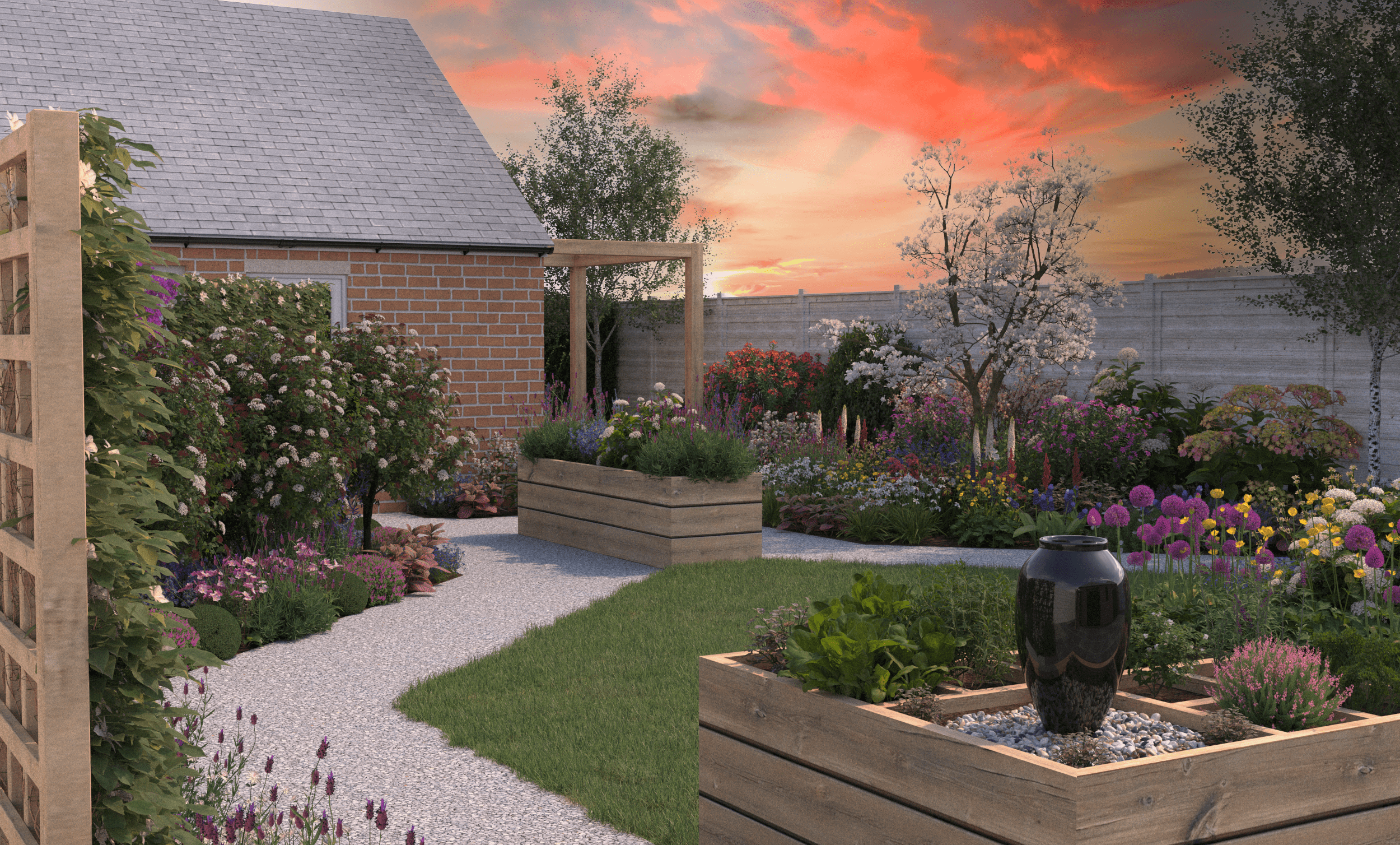
How to change your garden...colour combinations
In our second blog on colour we will look in closer detail at the colour theory rules mentioned in our first blog on Colour.
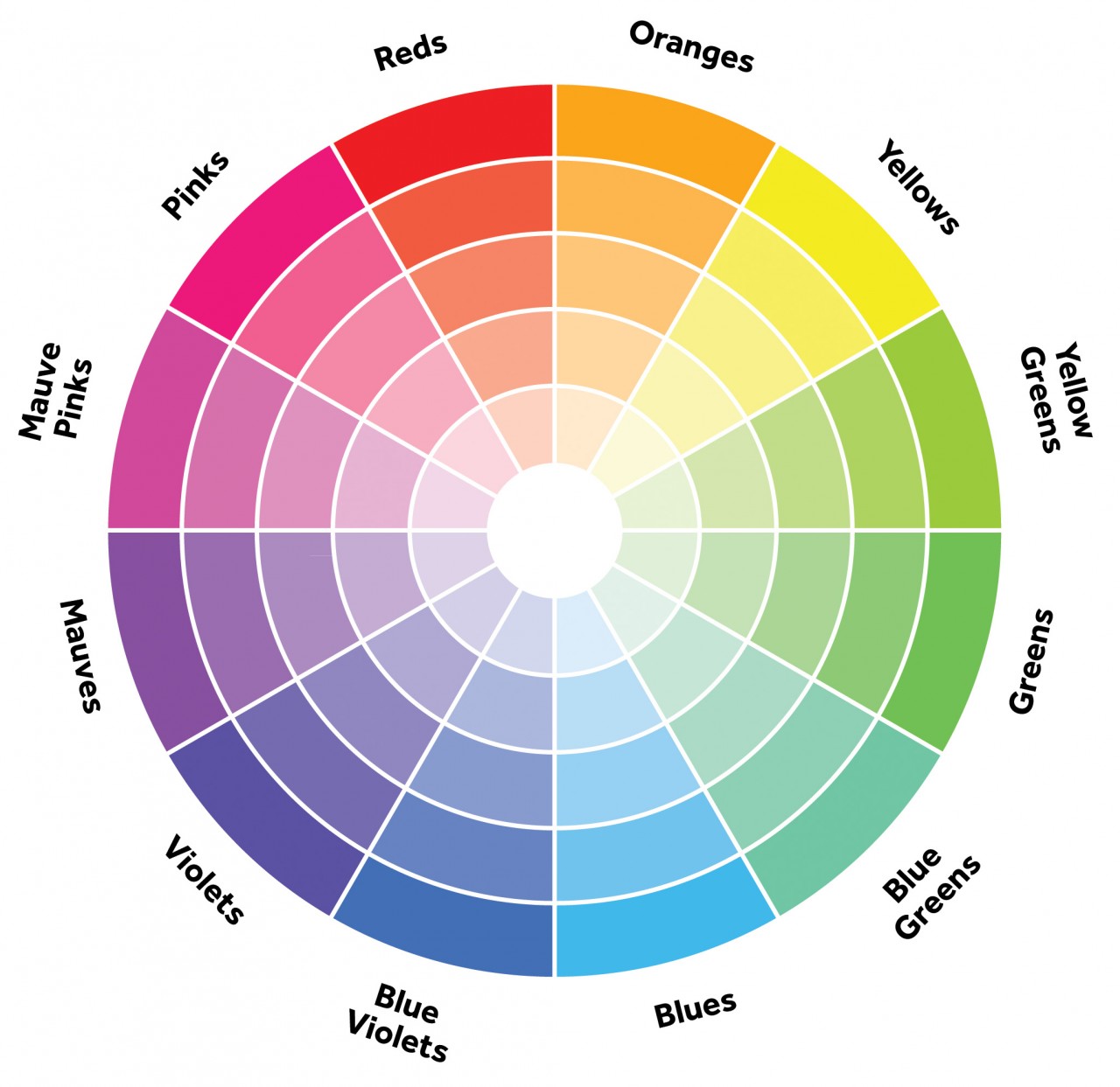
Most people are familiar with the colour wheel on the left, and this helps us understand the 'rules' of why some colour combinations work. All colour wheels work the same way of blending the three primary colours so yellow will always be next to green, red next to orange, blue always sandwiched between purples/violets and greens.
By looking at the colour wheel it is easy to see colours adjacent to each other are harmonious as they share one 'parent' colour. This colour combination is called analogous.
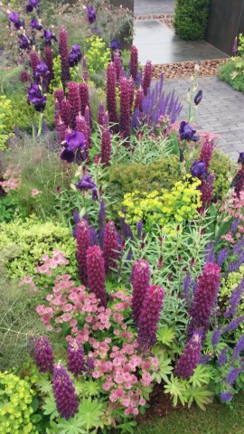
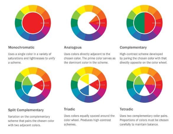
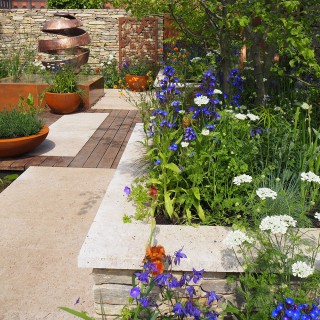
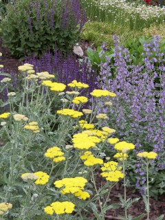
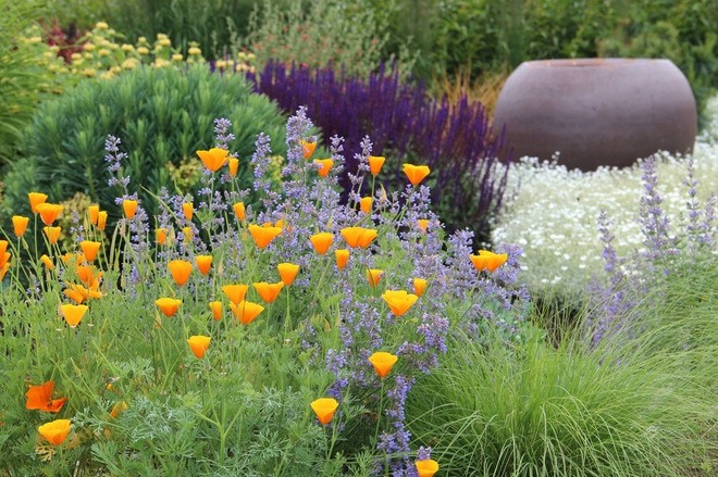
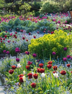
The further different colour combinations rules are explained on the right, and to help illustrate these colour options we have used different images of colour in gardens below.
Monochromatic
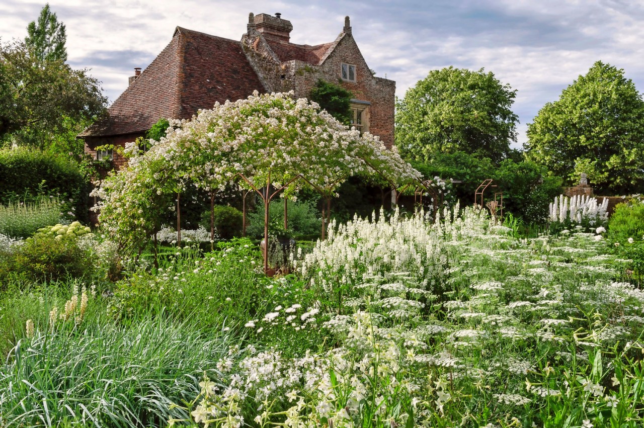
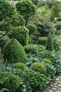
A garden of single colour really makes a big impact. The most famous of which is probably the white garden at Sissinghurst, Kent. Technically its two colour as it is virtually impossible to have a garden without any green colour. The exception to this is an all green garden which uses different shades of green and foliage types to great interest.
Analogous
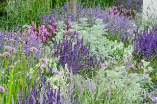
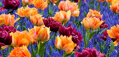
Three colours next to each other on the colour wheel perfectly compliment and tone with each other, as these examples show. This creates a natural look which can appear softer if lighter shades are used.
Complementary
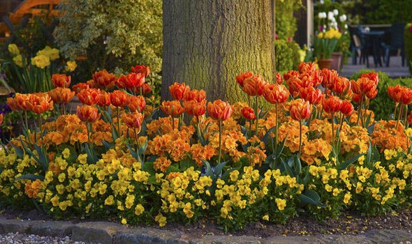
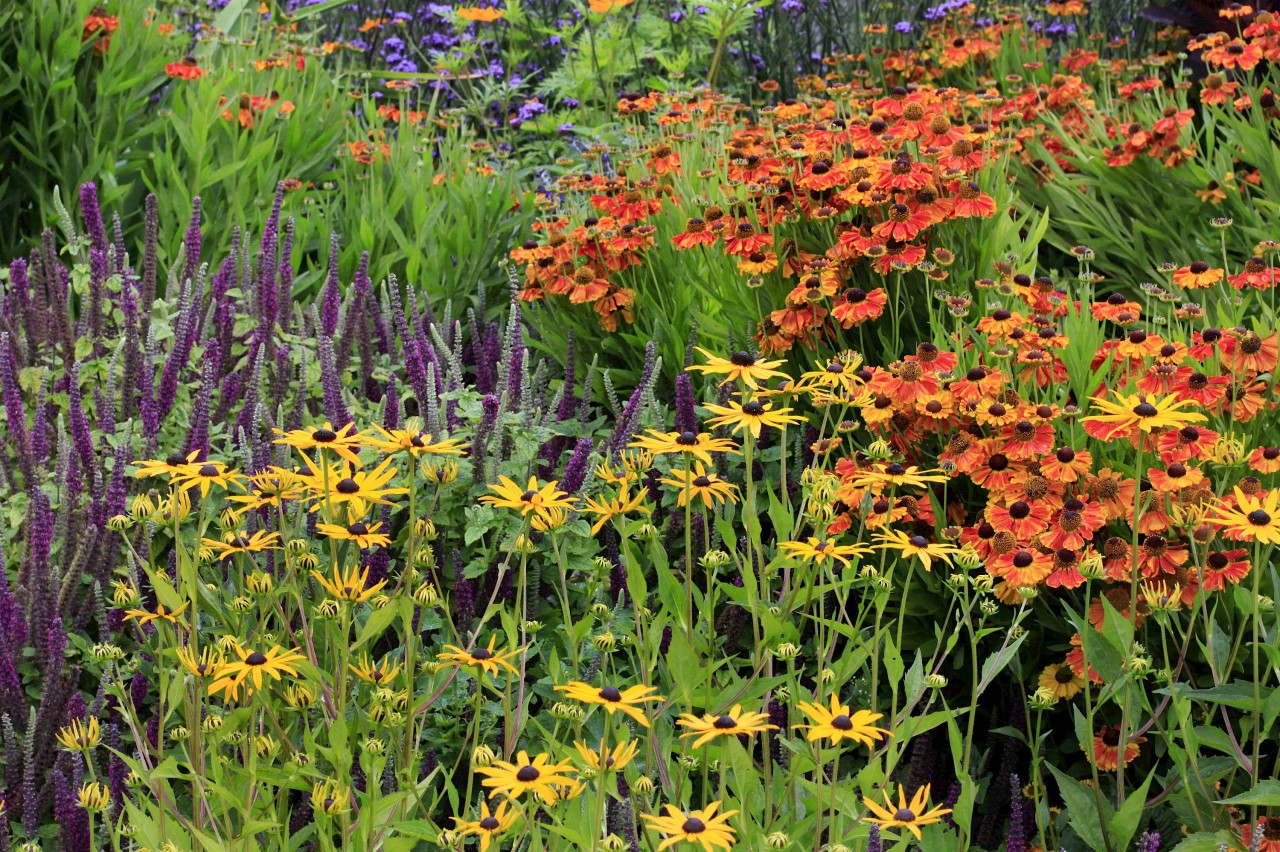
Colour combinations using colours directly opposite on the colour wheel are usually quite dramatic and create a big impact. An all red garden ticks the box for being both a complementary and monochromatic garden.
Split Complementary
An expanded version of the complimentary rule above. Instead of the direct opposite colour, it is the two adjacent colour to the opposite colour that are used. This scheme also creates a bold look.
Triadic
This rule uses different colours that are spaced around the colour wheel equally. These examples are using quite intense colour, but softer colours would give a gentler feel.
Tetradic
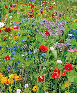
This combination uses two colours separated by another colour and their directly opposite colours on the colour wheel. As more colours are used the 'busier' the colour starts looking. This colour scheme needs careful balance of hues, shades, tints and tones if used in a large area.
Related Posts
By accepting you will be accessing a service provided by a third-party external to https://consiliopartnership.co.uk/

